First attempts at (three dimensional) asanoha
November 11, 2012
I’ve stitched asanoha (hemp leaf) two-dimensionally as part of my experimenting with sashiko (natural cotton stitched on indigo fabric), but not on temari stitch balls till now.
The stitching order is the same as in sashiko – it’s just that it looks so formidable on temari balls. I’ve managed to overcome this fear by reading Barb Suess’ excellent new book on temari techniques.
It’s worth following Barbara’s instructions to the letter, moving through her three examples. I’ve “Jumped around a bit” as you can see, inevitably regretting my lack of self-discipline.
My first go was the top one, a 25cm circumference wrapped in a light tan/brown-grey nicked from my recent teddybear making stash. Barb Suess has a natural affinity for brown and brown is often combined somewhat surprisingly with other colours in the traditional Japanese colour palette. We normally associate browns with sombre colour schemes, but the Japanese have a propensity to combine it with quite bright colours and you can see this to good effect in Barb’s use of red, white and blue, combined with both the light brown and a light blue. These additional lighter colours make all the difference and create a much more subtle effect than just the standard red-white-and-blue. So it was the red highlight that inspired me as much as anything else. Nothing to write home about concerning the process involved in stitching it, except that you obviously improve with practice the placement of the three-spokes in each small triangle. For an intricate-looking ball, it took surprisingly little time to stitch. Don’t pull the red stitches too tight otherwise they distort the bands underneath.
My second attempt took me to the next level of complexity, stitching #8 perle cotton instead of the thicker #5 perle cotton. The blue (light and dark) bands between the poles were the same as the previous one, but here I opted for #8 perle cotton in white, given that it too was only 25cm circumference. Here I got a little bit ahead of myself by not doing the white asanoha stitching right up to the seams, but a few millimetres beyond the blue bands (which I added after the white, not before). To “tidy up” the outside of the white stitching, I added two “framing” stitches right around the edges, something I’d seen in other examples. This allowed me to vary the width of the main blue bands. I have done one hemisphere of the white stitching, but the other half is still to be done. While the all-over white effect is lacey, I prefer Barb’s use of two colours (white and dark blue) just to create that extra bit of visual interest. Instead of red, I crossed the bands in a light green.
My third attempt at 26.25cm circumference is a copy of one by sensei Ozaki who stitched the whole thing in orange and white. I liked the Barb Suess colour combo that I stick with that. The spindles need to be nice and thick and I feared they’d be too big to allow much of the red to show – just go for it! The red is not a spindle, but involves taking the needle over and under the diamonds. The effect looks more complicated than it is in reality, which is half the fun of temari. Because the ball is so relatively small, I have started stitching the asanoha in white #8 perle cotton.
One can’t expect perfection when learning the technique, but it was easy to unpick those hemp leaves where the stitching was the most dodgy without having to do masses and masses of re-stitching. The longer I look at my work, the more mistakes I find – not mistakes exactly, but potential to improve by re-stitching. I’m better off leaving these initial attempts alone and simply getting on with stitching new ones; practice makes perfect.
A bit more on “framing” or putting a border around the geometric leaves. You can either have the band running over the asanoha regardless (do the leaves then run the bands over the leaf pattern compromising the geometry of the outer row of triangles all round) or you can have the asanoha criss-crossing right over the bands or you can have them “seamlessly” butting up against each other. It looks rough on the ball at the time, but I found it possible to simply run two stitches of white around my leaf patterns when you finish the asanoha stitching.
Asanoha – the pattern motif
In terms of background, we often forget that cotton was introduced very late into Japan (one can only marvel how the Japanese got through their summers without it) and that hemp was the mainstay of Japanese clothing right up until the 1900s (even well into the 1960s in some parts), especially in those parts of the country where rice couldn’t be grown. Farming people high in the mountains (and where isn’t it mountainous in Japan?) ate buckwheat and millet and clothed themselves in hemp. Taima or hemp in the West was vilified by a certain World Power during the last century (imagine, say, cotton being suddenly made illegal) but may one day be rehabilitated and regain its former position as an excellent fibre source. In the meantime, it makes sense that this mainstay of existence in Japan should be honoured in the star-like pattern of its leaves, asa-no-ha (lit. “hemp-of-leaf”). In Japanese pattern motifs, used not just in textiles but also in bamboo and woodwork, military insignia and ceramics, the fibre of wild wisteria (fuji; Wisteria brachybotrys Seib et Zuss.) is also honoured with its pendulous flower in the same way as paulownia wood is honoured in its three-part flower-plus-leaves.
Of course, hemp and wisteria are but two of many bast or plant fibres, which include ramie (choma), wild ramie (yamaso or karamushi) and nettle (miyamairakusa – akaso being a member of the irakusa or nettle family, with its red leaves, Boehmeria tricuspis Makino). Ohyo (elm; Ulmus lactina Mayr) was exploited by the Ainu in their atsushi clothing; linden (shina; Tilia japonica) was harvested for its fibre up until the 1920s.
All of these jimpi or bast fibres, originating from the inner bark of trees, vines and grasses, had different qualities – nettle not so strong, wisteria very very strong, etc. The warp had always to be nice and strong (the weft could be whispy and fine) and that’s where the strength of the weaving lies. Hemp was probably native to Japan, while ramie (and its processing technology) were imported from the continent in the late Jomon or early Yayoi period. Certainly hemp and ramie were the easiest to grow and treat and they won out against the weaker, poorer and thicker ones.
In the West, where linen was a mainstay, “flax” is used a a descriptor, approximating asa in colour and texture.
I’m inspired now to go back and read a bit more about asanoha in its initial, two-dimensional form as sashiko stitching. Temari stitchers honour their weaving and embroidery counterparts by copying features of those arts in temari stitching: weaving (both in textiles and bamboo work) is honoured through band-weaving on temari, folk stitching is honoured through replicating white-on-blue sashiko stitching.
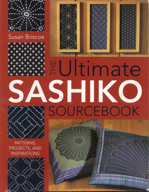
Susan Briscoe’s book is an excellent one since it provides, as its title suggests, a compendium of historical information, practical technical advice and inspiring use of contemporary work alongside more authentic historical stitching. Susan says the asanoha design motif came from China (as did almost all aspects of culture in Japan – it took the Japanese hundreds of years to break free and develop their own individual aesthetic) and that its radiating star represents the inner light of the soul. Buddhism is endemic in Japanese culture,even today; the extraordinary team spirit and compassion of the people is at odds with the individualistic selfishness of Western Christians, by comparison. With Buddhism came literacy, so the Japanese have this sense that culture, religion, literacy are all bound up into a single entity. Susan mentions the relationship between clothing and hemp, as opposed to cotton, and she also mentions that asanoha as often used in children’s clothing in the hope that the child would grow up strong like the hemp plant. Thus asanoha symbolized a wish for good health.
Susan presents three variations on asanoha: a kuzure asanoha which is a fragmented hemp leaf pattern, an elongated asanoha (kawari asanoha) and a “scattered” hemp leaf design (tobi asanoha), where the snowflake-like leaves don’t all touch each other at all points, i.e. there’s lots of negative space around them. This last has an Islamic look about it, and Susan mentions this being used in Islamic art.
My next post involves translating asanoha to a C10 and a 20-face temari where it’s combined with naturalistic flowers.
References
Barbara B. Suess, Temari Techniques: A Visual Guide to Making Japanese Embroidered Thread Balls. 2012: Breckling Press.
Shin-Ichiro Yoshida and Dai Williams, Riches from Rags: Saki-ori & Other Recycling Traditions in Japanese Rural Clothing. 1994: San Francisco Craft & Folk Art Museum.
Susan Briscoe, The Ultimate Sashiko Sourcebook: patterns, projects and inspirations. 2005, KP Books.
Karabana (The Imaginary Chinese Flower) & Kaki
June 11, 2012
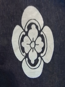
Karabana (or karahana) design on Japanese printed fabric featuring mon heraldic crests
“Four-petalled” leaves attached to the persimmon
Those of you familiar with motifs in Japanese textiles will know how common five- and six-petalled flowers are: plum, cherry, mulberry leaf, hemp leaf, Chinese bellflower, narcissus, oak leaf, pinks. Often seen also on Japanese textiles (and in other crafts) is the four-petalled flower, most often referred to as an ‘imaginary Chinese flower’. The “kara” in karahana (“h” in “hana” becomes a “b” in the alternative compound word, karabana) is an old word referring to China and of course hana means flower (as in hanabi, fireworks).
The geometry of five and six-petalled flowers is particularly powerful for stitchers of temari balls, since they fall naturally into the geometry of sophisticated 10-Division (S10 and C10) and 12-Division (S12) ball structures, but the four-petalled flower tends to get overlooked somewhat, probably because of its relative simplicity stitching-wise. The Japanese understand the starkness of the four-petals and often modify them with a four-segmented circle pattern – see the mon design above or inside a six-sided tortoise-shell or kikku.
It’s Winter here at the moment and while guavas are slowly ripening, persimmons – kaki in Japanese – are out on sale. I couldn’t help noticing how the leaves attached to the fruit conform to the four-petal model – perhaps the four-petalled flower isn’t so imaginary after all!
Persimmons are symbols of perfection, given their spherical nature; the colour is close to the vermillion beloved of calligraphers (and used to great effect in the famous avenue of orange torii arches at Fushimi-Inari in Kyoto) and when the juice is fermented, it becomes a powerful water-proofing agent for traditional rain-capes and umbrellas, as well as a lovely brown dyestuff known as kakishibu.
References
Ruby Kimono at http://greygoat.limewebs.com/kimonomotifsplants.html
Temari ball – Triwing and chrysanthemum
August 4, 2011
23.5cm circumf, pearl cotton #5. Cosmo 1 (colour photo p.25, pattern p.52)
Today’s continues my exploration of straightforward designs in Ozaki’s Cosmo volume 1. I didn’t want to get caught up in difficulties interpreting the instructions, so opted for a much smaller ball and went my own way with the number of rounds required.
Colourwise, I wanted to move away from the red-white-blue of the model. Mine is a tetrad (or contrasting four colours on the colour wheel) based on the violet of the mari: blue-violet, red-orange, yellow-orange and blue-green. My cobalt blue takes on a distinctly greenish tinge from the colours around it on the ball.
One thing I retained from the pattern was going from light to dark colours in the triwing and the opposite way in the kiku: dark to light. The stitching would probably me attractive on a white or cream mari, as per the model. I tend to find large triwings somewhat brash and imposing at the best of times.
In terms of symbolism, the wonderful thing about the triwing (mitsubane or mithua-bane, lit. mitsu+hane, three (as in the car company Mitsubishi or “three-diamonds”) feather or wing) is that it creates a hexagon in the middle, the classic tortoise-shell of kikkoh oft used in Japanese art and craft of all kinds. Denoting longevity, it was especially prized by samurai.
Combining colours – blue & red
July 19, 2009
Two photos of geisha kimono – one with a pale blue and red, the other with a darker blue and red – plus some chatter recently on the airwaves among the temari community about choosing colours for temari – have inspired today’s exercise:
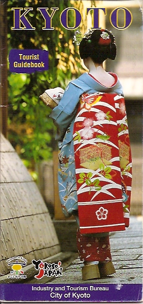
…a bright cobalt blue contrasting with a traffic light red, with secondary use of white and gold, plus green. In terms of motifs, the blue seems to contain autumn maple leaves, while the red obi obviously contains butterfly, cricket, cricket cage, etc. Such a strong duality of this red with this blue is not as common as the red/green complimentaries, while the trio of red-white-blue is no stranger to any of us.
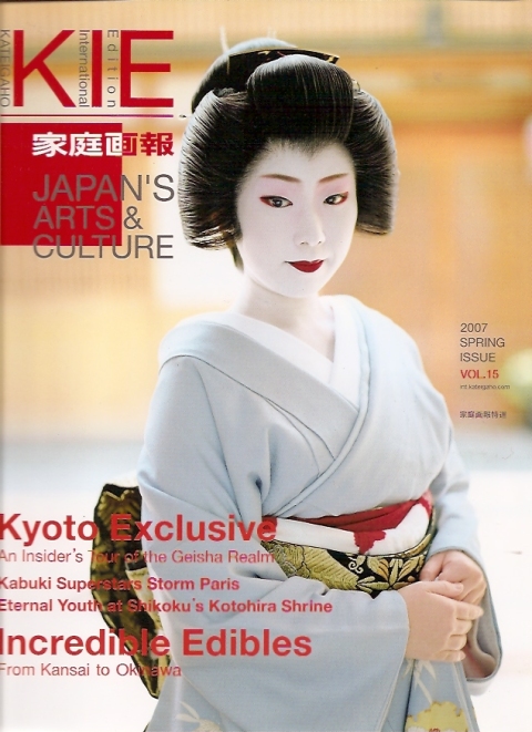
Similarly, this KIE magazine issue, hanging around since some previous posts on kanzashi and Kyoto, has a similar use of blue and red, with mediating black and gold (at least from this angle – stricly speaking, the overall effect is pale sky blue with black/gold if we consider just kimono and obi). The use of (obviously) hand-dyed red in the obiage behind the obi is very striking, and obviously imitates the facial makeup. I suspect there is some shibori used in the far right corner of this obiage – shibori always having a close relationship with obiage.
So, with this blue/red color combination in mind, I consulted my ‘bible’ in matters to do with Japanese colour combinations:
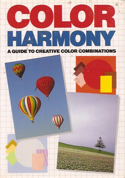
… in Hideaki Chijiiwa’s Color harmony, I find it is a combination used in traditional Japanese textiles. This is not surprising, when we consider the use of blue from ai indigo (pale colours indicating not many dips into the dye) and red from the traditional dye-source, benibana, known for its fugitive behaviour.
So, I set about using these colours in a temari of intermediate grade difficulty I’ve been meaning to make for some time. It’s in Ozaki’s Elegant Temari (ISBN 4837706959) and is done in red and white on a black mari: page 26, bottom pattern. I wrapped a sky blue mari and put in a simple 8 division in gold metallic thread. Followed by two overlapping squares 3cm from the poles. At this point, I need to say that the ball was exactly 23cm as per the pattern: interestingly, the pattern didn’t call for direct geometric divisions, e.g. a half, or a third of any set distance, but prescribed distances in centimetres. So in these cases, I follow the pattern and work out any ways of enlarging the pattern for larger balls later on.
Now the order of stitching is not exactly clear from the pattern, so with some experimentation and ripping out stitching as I went, I ended up doing a set of four ‘kite’ patterns and then doing the next four interlocking over and under the first (that is, do those labelled A then those labelled B). My first mistake was not to interlock the kites, so I had one lot completely overlapping the other… doh! During the ripping out process, I changed my colours from bright white and traffic-light red, to a darker crimson and a two shades of blue. This immediately made the whole thing a lot more tranquil – I have to say the red/white/black of the original has been putting me off for ages with its over-the-top striking quality! – but inevitably the crimson moves towards the blue becoming somewhat purple at a distance.
Unfortunately with a ball as small as 23cm circumference, every measurement counts, so tolerances for errors have to be extremely small. This is also a good exercise in keeping stitches parallel to jiwari guidelines, because they have to meet up at the ‘seams’ of the guidelines. Ultimately, I veered from my original intention somewhat in not having so strong a white contrast.
Picture to follow!
“Real” kiku from Japan
July 14, 2009
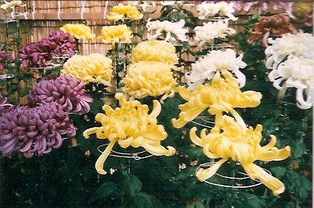
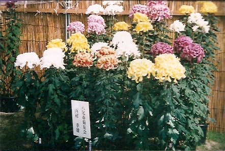
Two photos of chrysanthemums on show in Japan – large public displays in the grounds of the Osaka Castle and the Kyoto Botanic Gardens in late Autumn (last week of October and first week of November). Each pot produces a single large flower, with supports for the stem and the metal round supports under each flower as shown.
Chrysanthemums are a Very Big Deal in Japanese textiles – certainly as common as sakura (cherry) and ume (plum) when it comes to motifs using flowers. Some temari use the idea of petals of varying lengths as shown in some of the specimens here, as do designs on printed fabric, using katazome (paper stencils) and yuzen (paste-resist) or less traditional, more modern fabric-printing techniques. Of course, the very pure geometry of it makes it commonly seen in mon heraldic crests.
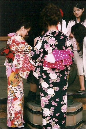
Here below is how it appears in the context of kimono: pink and white on a black background. The pink and white is reflected also (albeit in a different pink) in the obi. These two women were making a formal visit to Kiyomizu-dera (Kiyomizu Temple, Kyoto) in late Autumn, the time when kiku were flowering. Normally one wears a floral kimono slightly ahead of the flower season depicted. When I say a formal visit, I mean they were treating the visit as an occasion to pray. They were certainly the only kimono-clad Japanese among many thousands visiting the temple at the same time. Kiyomizu-dera, apart from being an enormously popular temple in Kyoto, is famous for helping students in exams, so on my mid-week visit to the temple, a lot of students were taking advantage of a blessing or two from the gods. The woman on the left is the younger of the two and is of an appropriate age to be wearing red and other bright colours. Tomorrow, some comments on kimono-wearing in contemporary Japan.
